The road from the first sketches of a story about an aging detective and her supernatural snitch to the final cover reveal last week was long. Almost eight years in fact. During that time the threads of the story came together in unexpected ways. The aging detective became a mentor passing the torch, and the FBI agent who came blundering into the second act became the lead point of view.
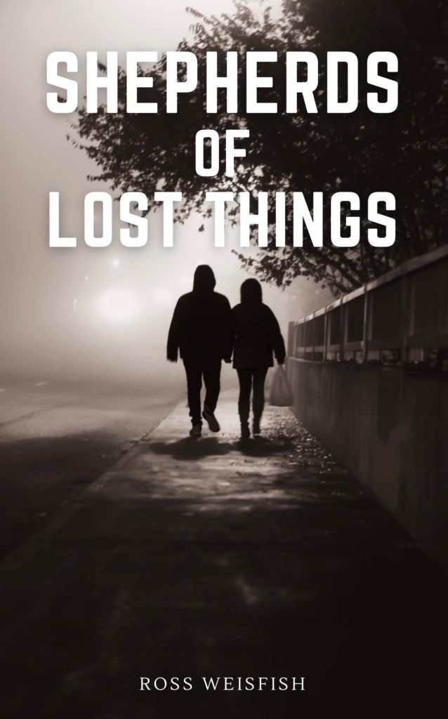
The title, SHEPHERDS OF, came fairly early on. Although originally it was FORGOTTEN THINGS not LOST THINGS. The change was made when the underlying themes started to become clearer to me. The idea of shepherds as those who keep others safe against darkness had a big influence on my initial cover art ideas. The following was the temporary cover I used for a long time while I worked on the book.
Full disclosure here, yes I used some AI generators to quickly imagine possible cover art. The final cover was not created by AI. It is a photograph of real objects, with some minor Photoshop touchups.
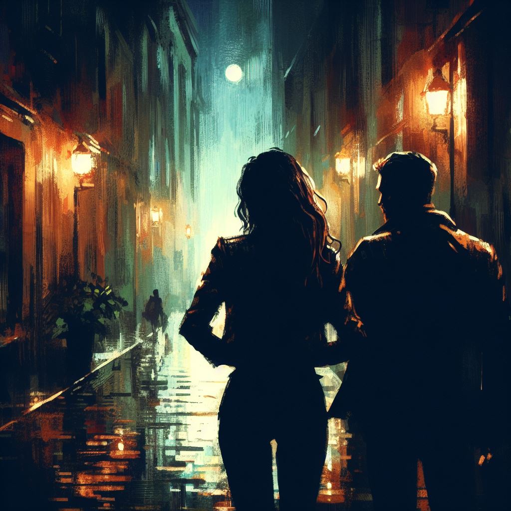
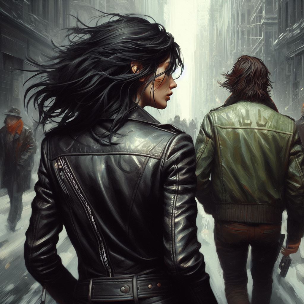
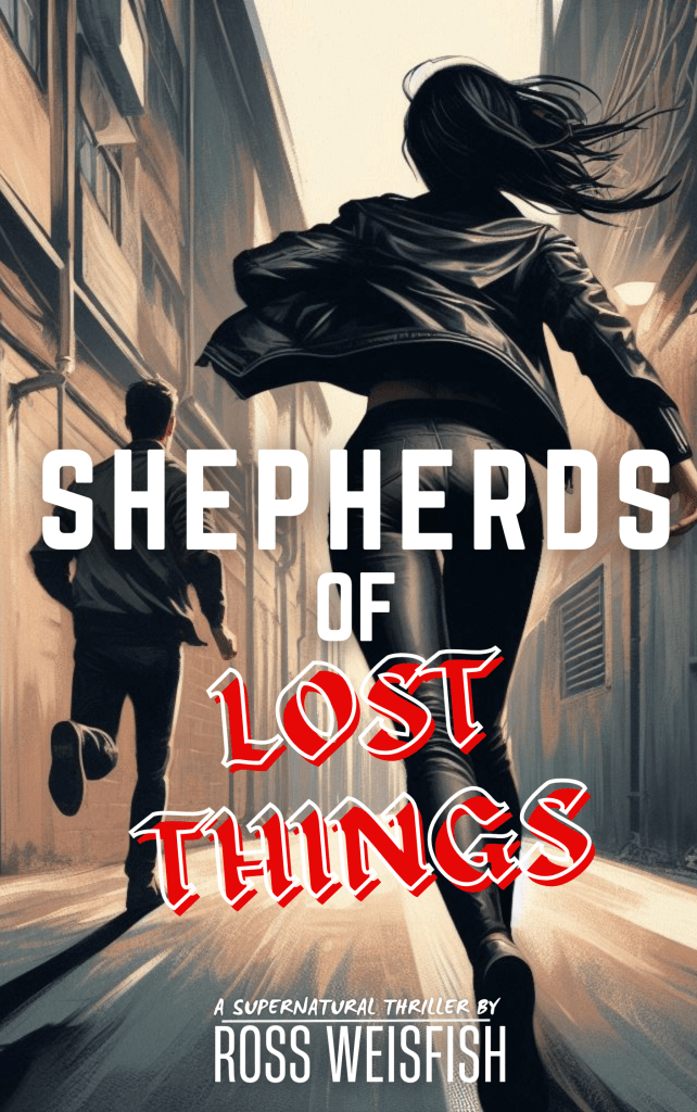
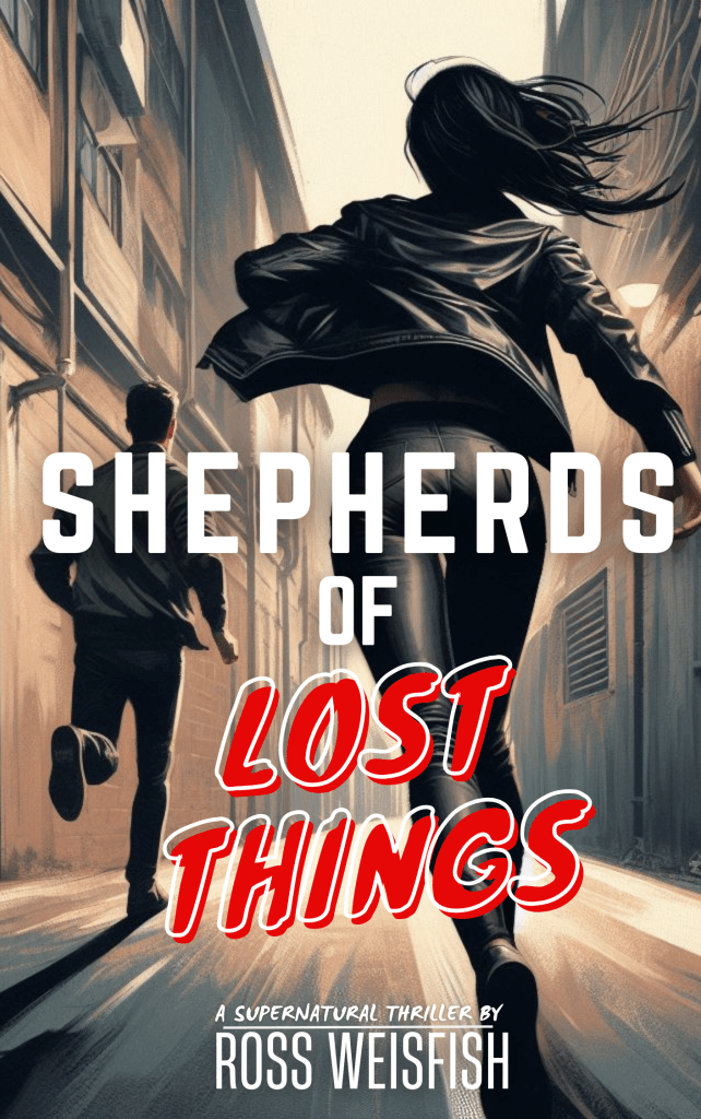
As I got closer to being ready to publish the book I knew it was time to start putting together ideas for a cover. Sending scribbles to a professional artist didn’t seem like a great use of anyone’s time. Spinning up an image generator I started with the concept of the main character, by herself, in a dark city.


However, the title of the book is SHEPHERDS OF LOST THINGS. The plurality needed to be reflected in the cover. So I added John Alex, the snitch who was her guide through the supernatural events of the book. I was aiming for an old school pulp detective vibe.
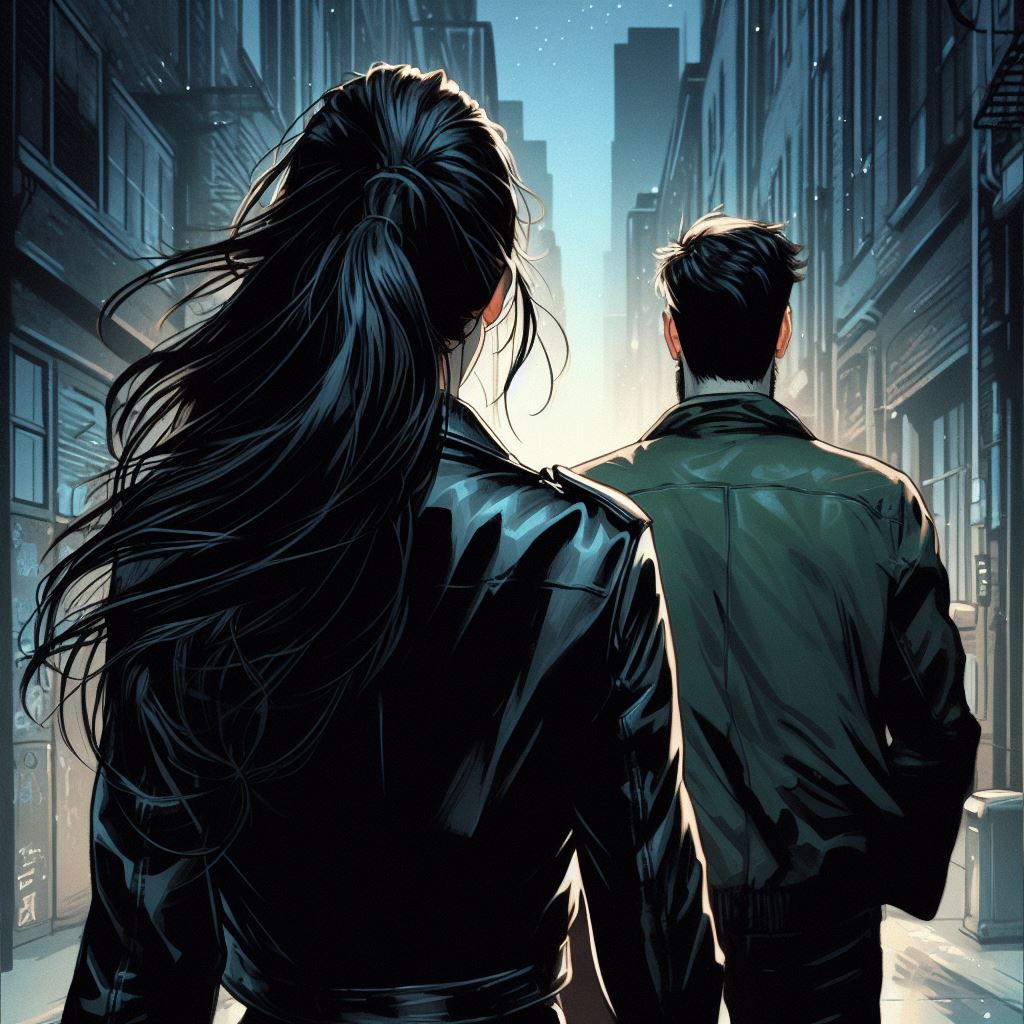


Getting closer, but the cover needed a bit more action. What if they were running?
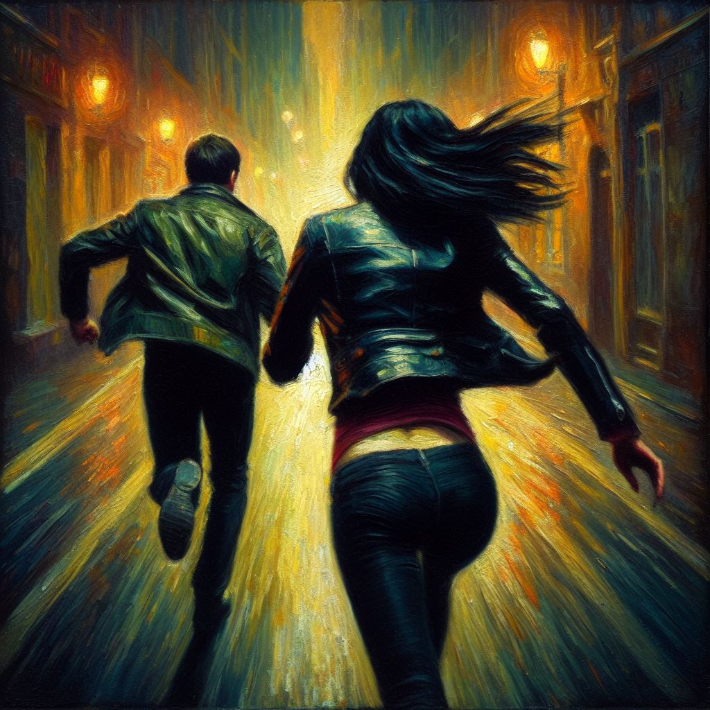
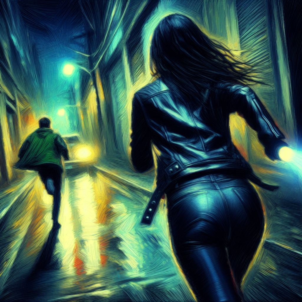

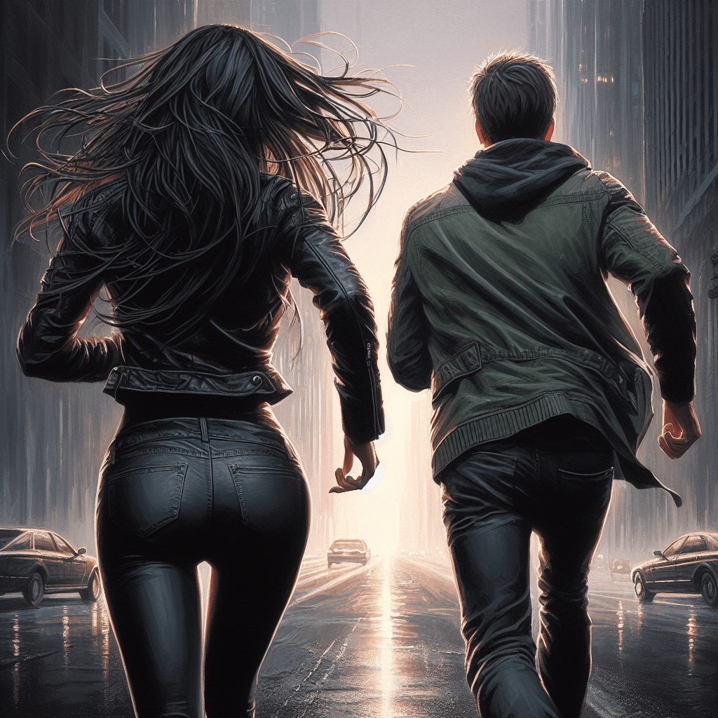


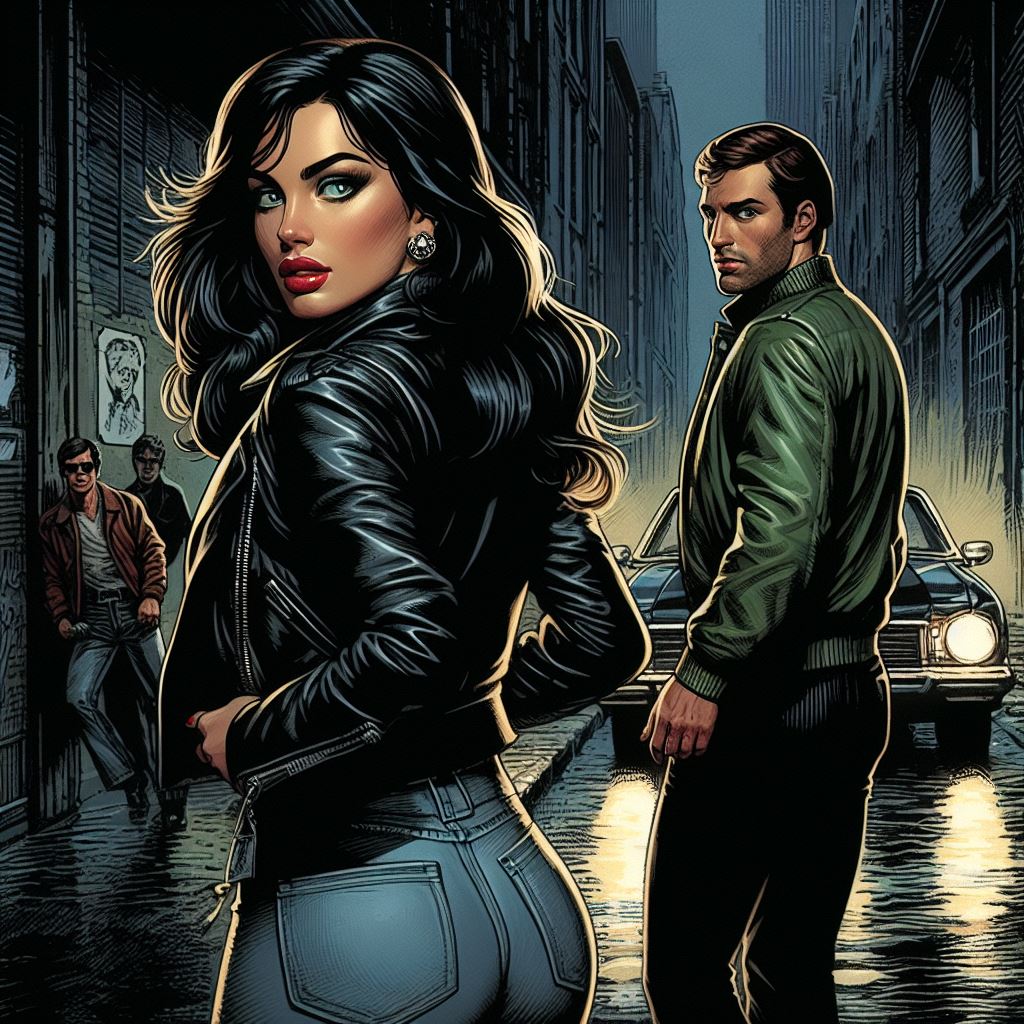
Now I felt like I had something that could work, so I started playing around with font choices and coloring.
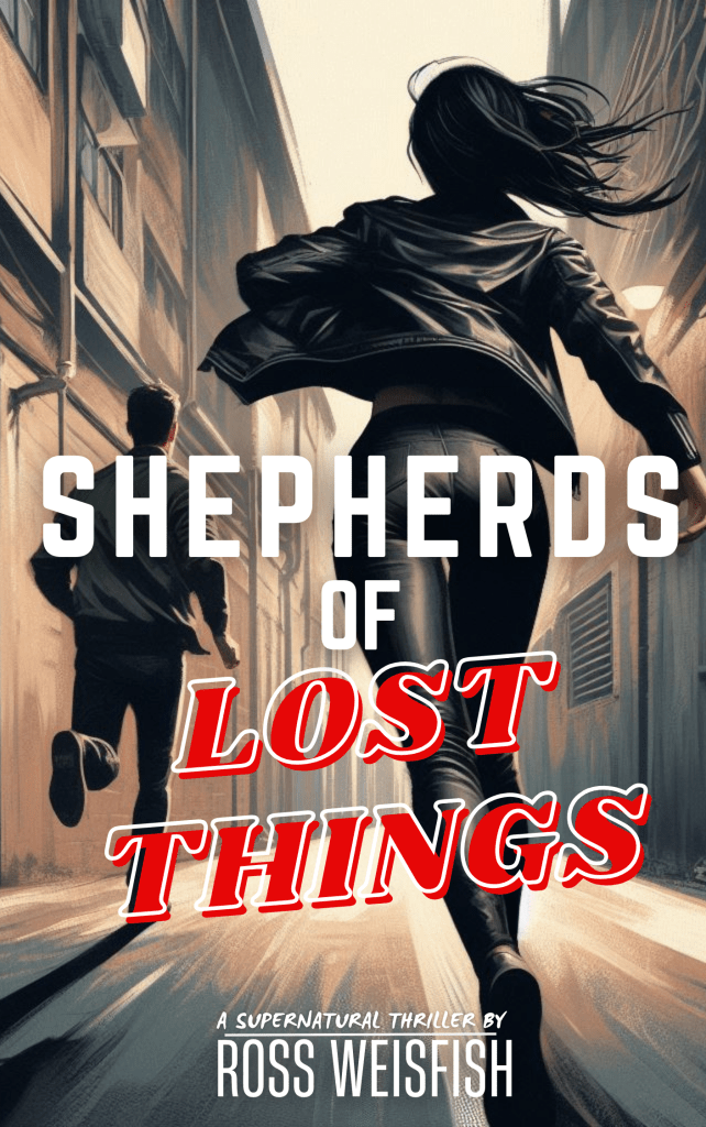
However, once I had a concept that I was happy with I quickly realized that finding an artist to bring it to life was going to be the hard part. When an email exchange ended with news that the artist was booked out into next year, it lead me to rethink the whole cover.
I needed a cover design that was within my skill level. On my last book, THE HEART OF LIGHTSPEED, I had used a photograph with some color tweaking in Photoshop. What could I photograph that would be a good cover?
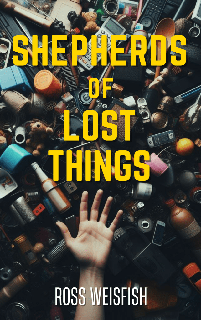
This lead me to think… What if the title, “lost things,” was the cover inspiration? Literally, lost things scattered on the ground. This would be a great nod towards how in the story the killer scatters things around as they ransack crime scenes.
A quick test prompt in an AI-generator created this. Which made me feel like I was on the right path.

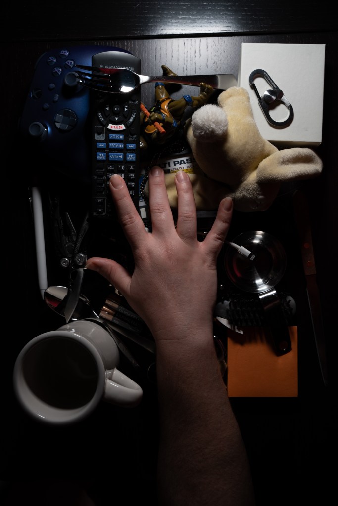
Gathering common household things that often get lost, I did a couple test photos.

With and without a model’s hand. After some back and forth it became clear that the cover was much creepier and more attuned to “thriller” with the hand at the bottom of the frame.

Then I did crafted some rough mock ups with the title:
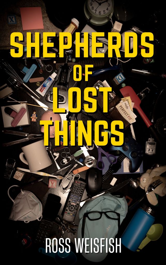

I realized that the clutter needed to be darker and tinted to improve legibility of the book’s title, which lead me to my first solicitation of feedback from my test readers:
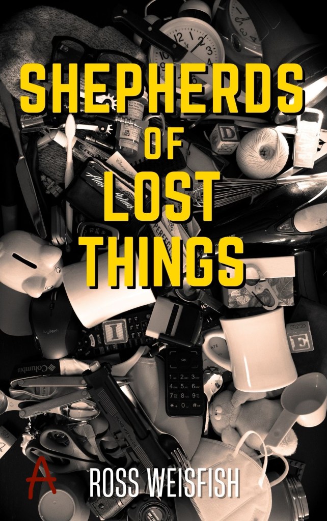

With option B being the runaway winner, I went back and tweaked the scene some more. More stuff was layered on my craft table. An arm was added. Colors were pulled and darkness added until it felt appropriately creepy. I brushed out the brand names on the household objects. It seemed like it was ready.

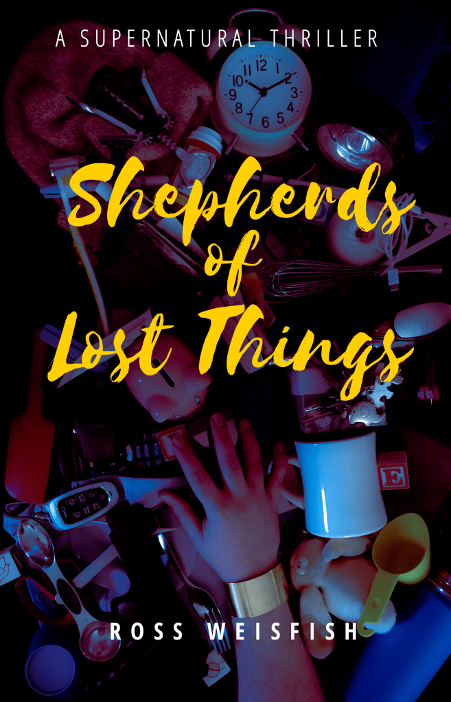
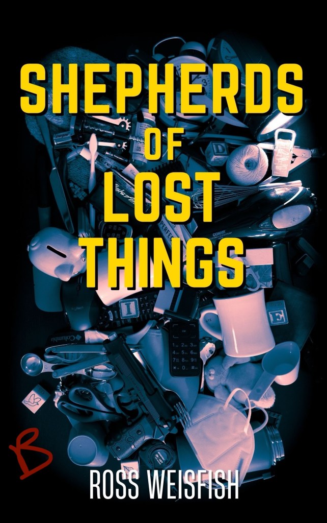
However, the cover was critiqued harshly by cover design reviewers on Reddit’s r/bookcovers. They suggested a more “thriller” appropriate font was needed. Someone helpfully suggested that the lettering needed texture to help it pop. I went back to my original font with an added brass patina metal backing to the lettering.
This is the final version and it feels good. I can’t wait for all of you to hold this in your hands on October 1st. If you want to read more about the book, click here!